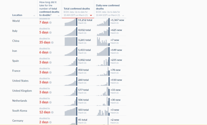
You can find these at other sites, but you have to visit a lot of other sites. So here at one single site are multiple dynamic graphs which we found interesting to help put the coronavirus in perspective. They cover worldwide deaths, cases, rate of growth in the US as compared to other countries, testing, and the critical hospital bed issue. We are making progress. Hang in there. If you have a good informative graph, let us know and we can add it.
https://losal360.com/coronavirus-statistic-dashboard/


